Focus
Erik Sommer — Controlled Chance: Painting as an Act of Time
Erik Sommer soaks raw canvas until spray paint bleeds through, producing marks that look aged the moment they're made — controlled chance as working method.

Stand close to a canvas by Erik Sommer and a simple question stops making sense: was this color applied, or was it always there. The pigment has sunk into the weave rather than sitting on top of it. There is no ridge of paint to catch the light, no brushstroke to trace back to a hand.
The effect is disorienting in a specific way. Most abstract painting announces its own making — a stroke, a pour, a scrape. Sommer's canvases resist that reading. The color looks bled rather than laid down, aged rather than fresh. It seems to have been waiting under the surface before it broke through.
That confusion is the point of entry into his practice. Erik Sommer works in stained spray paint on raw canvas, a method built to erase the moment of application from the finished object. What remains looks less like a record of a decision. It looks more like a record of time passing — vibrant and faded within the same square inch.
Understanding how that effect is produced changes what the paintings ask of a viewer. This is not a practice about capturing a single gesture. It is a practice about staging conditions, then stepping back far enough to let the material make its own decisions.
The materials themselves are ordinary. Raw cotton canvas, aerosol paint, water. Neither is rare or precious on its own. What Sommer does with the combination — forcing a fast, industrial pigment to behave like a slow, absorbed stain — is where the practice lives. The canvas does the aging. He decides when to stop it.
The Process: Intention and Accident
Sommer's technique starts with a decision most painters never have to make: whether to prime the canvas at all. He doesn't. Raw, unstretched canvas is porous in a way primed canvas is not. It drinks pigment instead of holding it on the surface, and that absorption is the mechanism his work depends on.
The canvases are layered, soaked, and saturated with spray paint until the pigment travels through the fiber rather than resting above it. Sommer has described the resulting marks as looking "both bold and aged, vibrant yet bleached." Stand in front of one and the phrase stops sounding like a contradiction. A single passage of color can look freshly sprayed and decades-worn at once. The raw canvas processes paint the way it might process weather: unevenly, permanently, without asking permission.
This is where intention and accident split the labor. Sommer chooses the canvas, the layering sequence, the saturation, the moment to stop. What he does not choose is exactly how the pigment travels once it enters the fiber. It pools in some places, thins in others, bleeds into a neighboring color before either has dried. Controlled chance is the only honest name for a process built on setting conditions and losing a measure of authorship to the material itself.
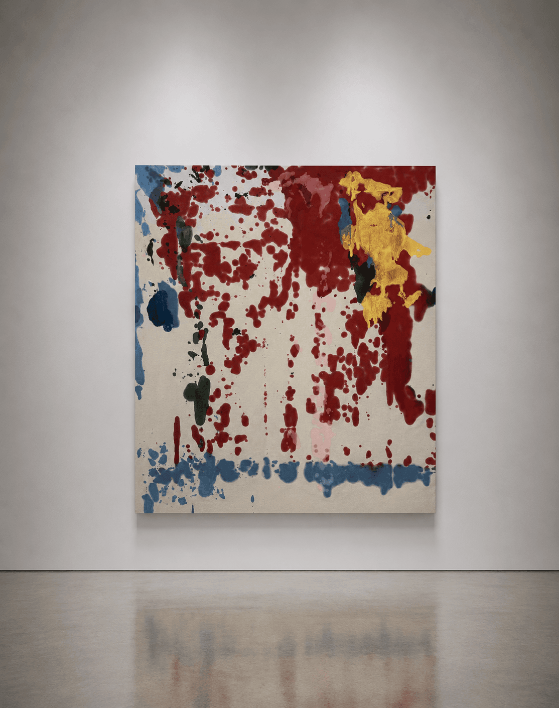
BLUE CHEER makes the mechanics visible with unusual clarity. A near-vertical curtain of oxblood red falls in dozens of individual drips from the upper edge of the canvas. It arrives at a pooled band of blue that settles along the bottom like sediment. In the upper right, a burst of gold interrupts the red, its edges bleeding into olive green where the two pigments met while still wet.

Three colors do the work of many here. The drip pattern above the blue is Sommer's staging — where he directed the aerosol, how long he let it fall. No two drips travel identically once they hit raw fiber. The soft, bled edge on every one is the canvas answering back. The blue pooling at the base reads almost like a horizon line, a boundary the red falls toward but never crosses cleanly.
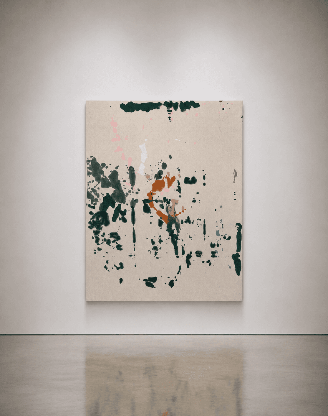
ALONE IN THE WOOD pushes the same process toward a sparser result. Nearly all of the composition's weight gathers along the left edge — teal and forest green pooling and dripping in overlapping rounds. The paint sits thick where the aerosol was held close, thinning to fine spatter at the margins. A smaller knot of burnt orange breaks the cool register near the center. The right half of the canvas stays almost entirely bare.
That imbalance is a choice Sommer makes at the staging level — how much canvas to saturate, how much to leave alone. The exact shape of the teal mass and the knot the orange forms were not planned. Nor were the black drips settling low like afterthoughts, corrected after the fact. On raw canvas, correction isn't really available. What lands, stays. Sommer's authorship lives in the setup and the restraint to stop, not in fine control over the outcome.
The physical process behind both paintings involves repeated soaking and transfer. Canvas is layered over canvas, pigment pushed from one surface into the next, colors meeting each other while still wet. It's a slower, more physical method than it looks from a distance. A finished canvas can represent several rounds of saturation, each adding density the last round couldn't reach alone.
The Curator as Artist
Sommer's relationship to his own material is shaped by a role most painters don't hold. He is also the founder of Mott Projects, a contemporary art space in New York. Running a gallery means looking at finished paintings constantly, from outside the studio, in the context of walls, light, and other artists' work.
That vantage point differs from a painter's. An artist working alone tends to evaluate a canvas against their own last canvas — a private, internal continuity. A curator evaluates a painting against everything else in the room. That means judging what it needs to hold its own next to, and what makes a body of work read as coherent. It also means noticing what makes a collector stop and look. Sommer accumulates that judgment daily, on other people's work, before he brings it back to his own studio.
It shows in the discipline of his restraint. A painting like ALONE IN THE WOOD, with half its surface left bare, is a curatorial decision as much as a painterly one. That kind of choice comes easier to someone used to editing a show down to what actually needs to be on the wall. Knowing when a composition is finished, rather than merely stopped, is exactly the judgment a curator exercises on other artists' behalf, week after week.
The reverse is also true. Directing Mott Projects gives Sommer a working knowledge of how a stained canvas performs in a gallery over months. Not just at the moment it's finished. He sees how the raw ground ages, how collectors respond to work that resists a tidy explanation. He also sees what actually holds attention in a room full of competing paintings. Few artists get that feedback loop from inside their own program. Sommer built one.
That feedback loop cuts both ways. Sommer has spent years watching how other artists' finished work reads once it leaves the studio and enters a room full of strangers. He has seen where attention lands first, what a viewer forgives, and what they don't. Bringing that outside vantage point back to his own canvases is a rare advantage. Most painters only ever see their work through their own eyes, or through a dealer's.
Time as Material
Sommer describes his work as existing "in an absence of time." His canvases look simultaneously fresh and weathered, unable to be placed on any clear timeline. That ambiguity isn't a side effect of the staining process. It's arguably the actual subject of the work, with color and composition as the vehicle.
His titles complicate that reading further. Where the imagery stays resolutely abstract, the titles reach for something specific — a phrase, an address, a fragment of speech. That gap, between what the canvas shows and what the title names, becomes its own layer of meaning.
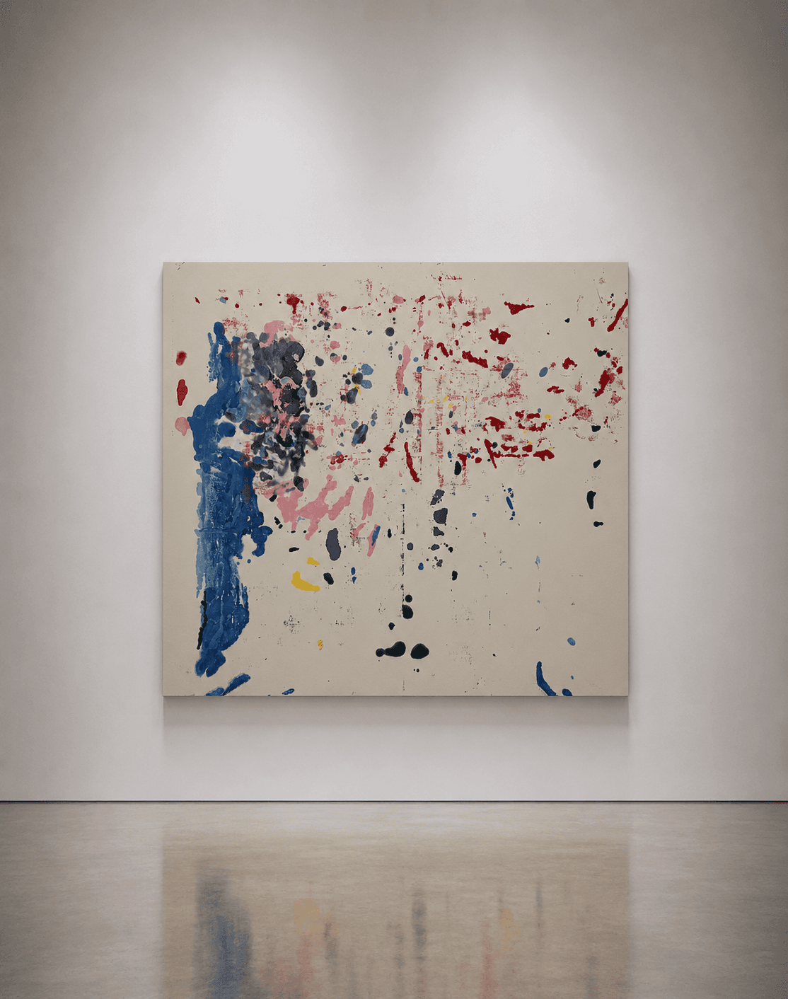
HAPPY BIRTHDAY carries the tension plainly. A heavy fold of cobalt blue runs the full height of the canvas's left edge, its surface ridged where paint pooled and dried unevenly. Directly above it, mauve, plum, and black tangle into a single dark, compressed knot. Red drips scatter loosely across the center and right, thinning as they move away from the blue.

Nothing about the somber cluster of dark tones on the left reads as celebratory. That's the friction the title introduces: a phrase loaded with occasion, dropped onto a composition that withholds any clear feeling. Sommer doesn't resolve the mismatch. He leaves the viewer holding both readings at once, the way a birthday itself can hold joy and melancholy together.
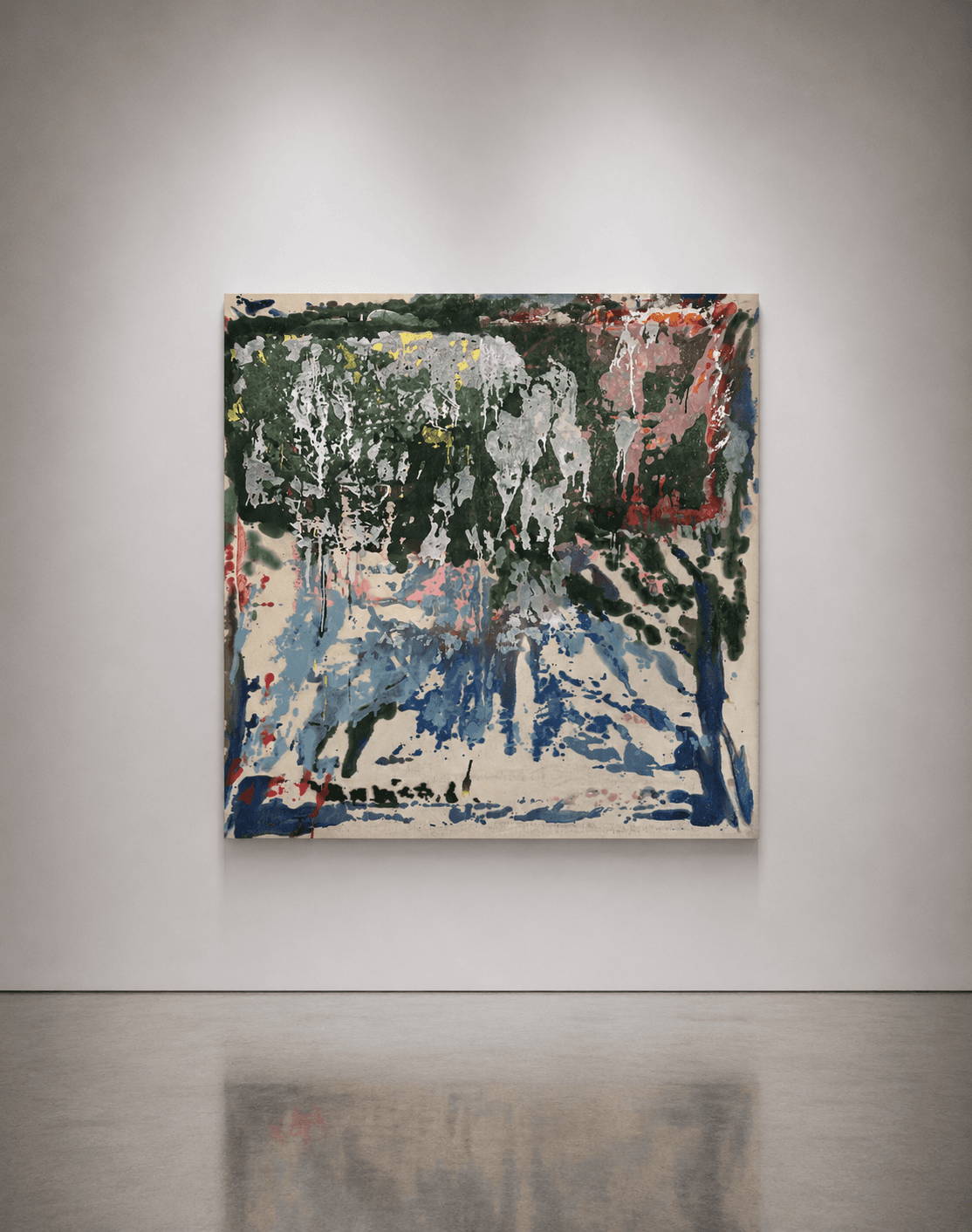
I WISH [...] THE WORLD pushes the same device further, using punctuation as much as language. A dense canopy of dark green and silver-white drips runs across the top third of the canvas. In places, it's heavy enough to obscure the raw fiber beneath it. Below, a pale blue and dove-grey wash spreads downward like mist, broken by a single dark green vertical form standing apart on the right.
The title's brackets mark an omission — a thought interrupted mid-sentence, a wish that never states its object. That elliptical structure mirrors the canvas itself, which reads closer to a landscape than anything else in Sommer's current output without ever depicting one directly. A scene withheld rather than completed, in both title and image.
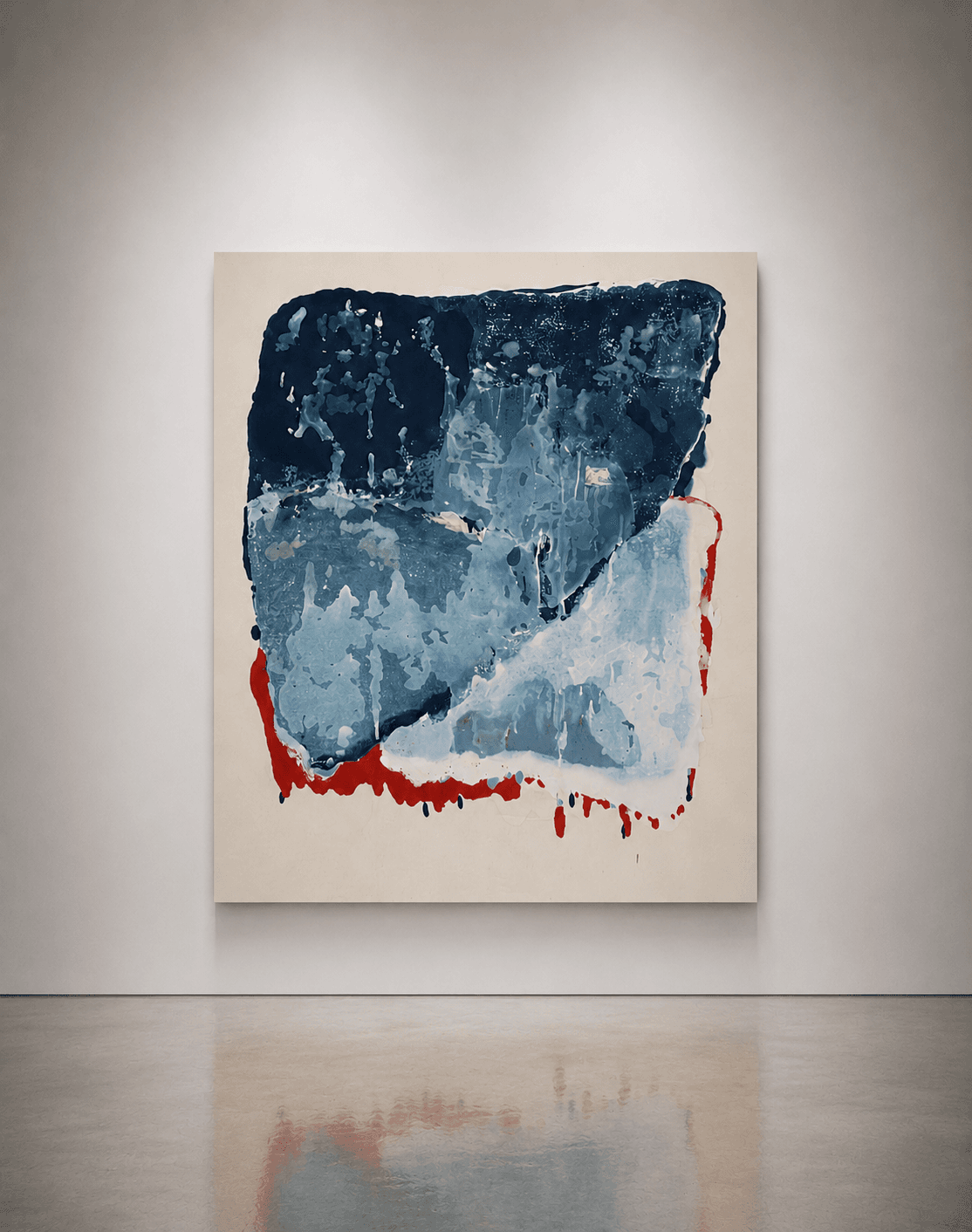
YOU ARE ALL THE COLORS [...] approaches time differently, through restraint rather than density. The canvas is built almost entirely from a single hue pushed through its full range. Deep navy sits at the top, fading to pale ice blue and dove grey near the base. A bold red seam traces the lower and right edge, its drips bleeding down onto bare canvas.

A tonal gradient is itself a record of time. The eye reads navy fading into ice blue the way it reads a sky at dusk. A single hue passing through a duration, not a single moment. The title's open claim, undercut by its own ellipsis, sits against a canvas that appears to hold almost no color variation. A deliberate contradiction, and Sommer leaves it standing.
Read together, these titles function less like captions and more like a second material Sommer is working with. They are staged as deliberately as the paint, and just as resistant to full control once released into the viewer's reading. The abstraction stays open; the title narrows it just enough to make the openness feel intentional.
Why Collectors Are Watching Erik Sommer
An artist who also runs a gallery brings a market fluency that few painters develop from the studio alone. Sommer has spent years on the other side of the transaction — pricing work, placing it, watching what collectors actually return to after the opening. That perspective shapes his own practice with unusual clarity about what makes a body of work collectible, not merely interesting.
The process itself is a scarcity signal. Stained spray paint on raw canvas cannot be rushed or mass-produced without losing the quality that defines it. Pigment needs time to travel through unprimed fiber. Sommer's willingness to stop before over-saturating a canvas is a discipline that limits output by design. It's visible in the near-bare right half of ALONE IN THE WOOD. That is a different kind of rarity than a limited print run. See our guide to limited editions for how numbering and scarcity typically work across mediums. Here, scarcity comes from process, not from a printed edition number.
Consistency matters too. Across all five canvases, the vocabulary never wavers — raw canvas, saturated pigment, restraint about when to stop. Only the palette and density shift, from sparse to dense to near-monochrome. That coherence is exactly what a curator would look for in another artist's roster, and Sommer applies the same standard to his own output. For more on how that coherence gets evaluated before an artist even joins a gallery program, see how we choose an artist for the roster.
Finally, Mott Projects itself functions as a signal. An artist who has built and sustained a contemporary art space in New York has skin in the market beyond their own sales. That stake in the field's health tends to produce a more considered, less reactive studio practice. For collectors, that combination of process-driven scarcity, formal consistency, and institutional standing is a stronger foundation than a single striking canvas on its own.
For a first acquisition, look at how a work handles density before anything else. BLUE CHEER and HAPPY BIRTHDAY carry weight across most of the canvas. ALONE IN THE WOOD and YOU ARE ALL THE COLORS [...] rely on restraint, letting bare ground do as much work as pigment. A collector who owns one of each holds both ends of Sommer's range, not just a single mood caught once.
FAQs
Who is Erik Sommer?+
What is his artistic technique?+
What is Mott Projects?+
Where can I view and purchase his works?+
Conclusion
Return to that first moment in front of a Sommer canvas — the instant before you know whether the color was applied or simply arrived. That uncertainty doesn't resolve with explanation. Even knowing the process, the eye still can't quite separate the paint from the fiber it disappeared into.
That's the closest thing to a thesis this body of work offers. Erik Sommer's paintings are not fabricated the way a composed, corrected canvas is fabricated. They are discovered — staged into being, then left to settle on the canvas's own terms, into whatever the raw material decides to keep.
Erik Sommer's work can be viewed at AH Milans Gallery, and followed at @erik___sommer and eriksommer.art.
Related artist
Erik Sommer→